Challenges Getting Docusaurus Styles Into Storybook
I thought it would be a good idea to have a central location to showcase whatever components I add to the Docusaurus repertoire.
I'd worked with Storybook before, and found it pretty handy. During development, it gives you a way to interact with a component-in-progress and see that it works as intended. It can serve as a beginning basis for unit and component tests, and it can be a really handy tool for communicating with non-technical stakeholders... clicking on a component and seeing immediately how it responds is much easier to grasp than an engineer trying to explain something to you in non-engineer-speak as best they can. The proof is in the pudding, as they say.
Another nice feature is its extensibility. If it doesn't do something you want it to do, you can often create an addon or a decorator that will accomplish it.
So I downloaded the dependency, and began writing stories for my shiny new 'Expandable' component.
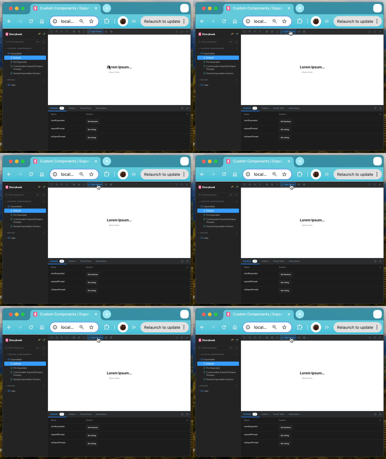
Imagine my distress when I started up the development server for the first time and saw that my themes weren't being applied to the custom element. I worked hard to include those themes!
(I promise, I'm clicking the button in the screen recording shown below)

It took me a little while to track down the problem. It turns out that
Docusaurus and Storybook drive their theme-based styles off of different
conditions. Docusaurus applies a data attribute at the root of the HTML
document, which it then uses as the selector for its CSS styles. Storybook uses
the built-in class attribute.
I didn't want to pollute my code with a bunch of redundant attributes that accomplish the same thing. Happily, I was able to leverage Storybook's extensibility to solve that problem.
I created a Decorator... an object that Storybook, in essence, wraps around
your stories to provide new functionality. In this case, I captured the current
theme from the Storybook context, and set the data-theme attribute at the root
of the preview pane accordingly.
Here's my very simple decorator:
import React from "react";
import { useEffect } from "react";

// apply a data attribute ('data-theme') at the root element of the
// Storybook preview iframe so that Docusaurus styles are applied
// within the preview
export default (Story, context) => {
    const { theme='light' } = context?.globals;
    useEffect(() => {
        const themeRoot = document.querySelector('html');
        themeRoot && themeRoot.setAttribute('data-theme', theme);
    }, [theme])

    return <Story />
}
I applied those to every published story via my .storybook/preview.ts file, and now my
themed Docusaurus components respond to the dark/light theme in Storybook!
import type { Preview } from "@storybook/react";
import './assets/styles/docusaurus_global.css'
import withDocusaurusStyles from './decorators/withDocusaurusStyles';
import { withThemeByClassName } from "@storybook/addon-themes";

const preview: Preview = {
  decorators: [
    // highlight-next-line
    withDocusaurusStyles,
    withThemeByClassName({
      themes: {
        light: 'light',
        dark: 'dark' ,
      },
      defaultTheme: 'light',
    })
  ],
  parameters: {
    controls: {
      matchers: {
        color: /(background|color)$/i,
        date: /Date$/i,
      },
    },
  },
};

export default preview;
Pretty pleased.
